Nitt Beauty
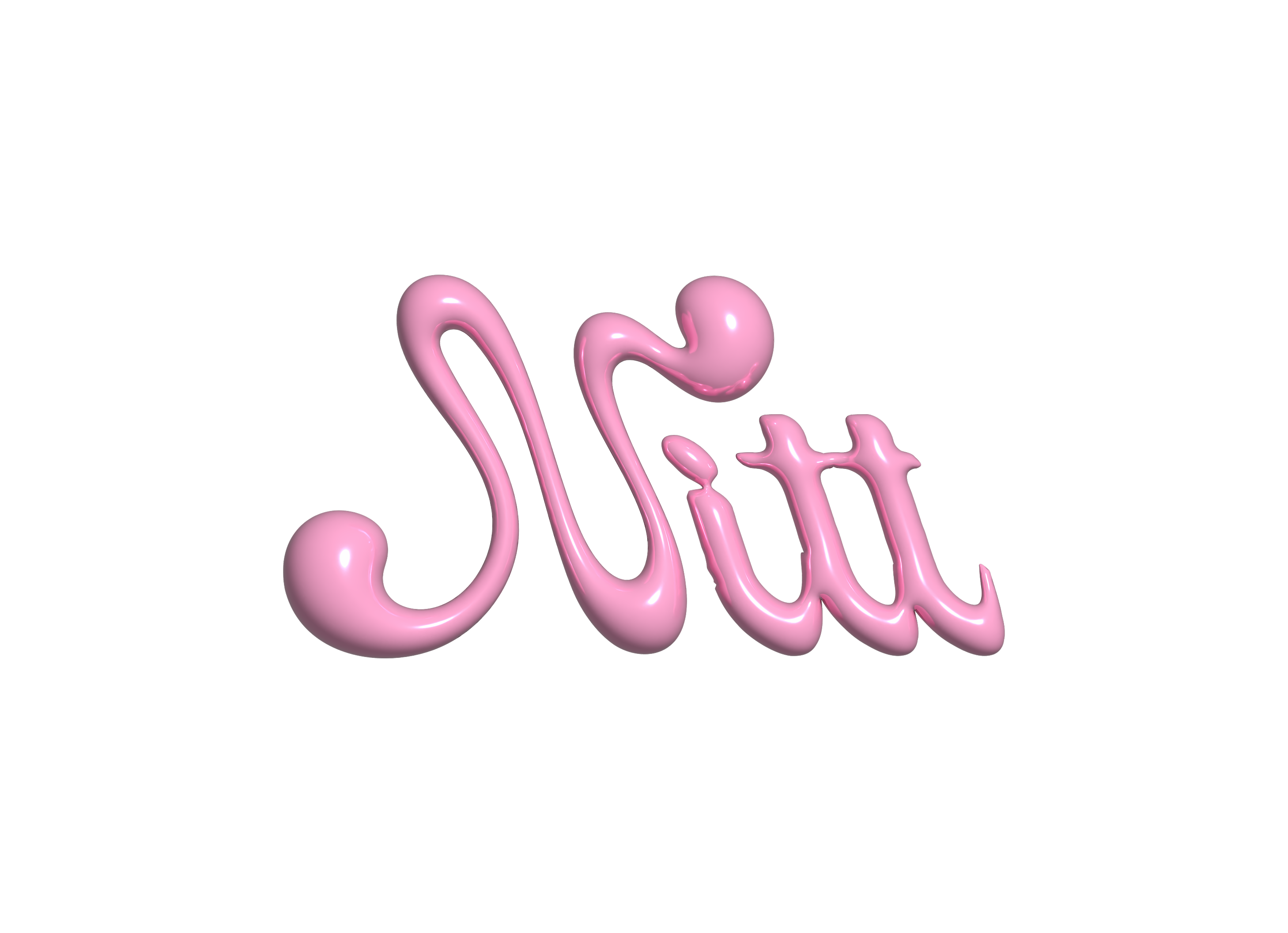
We collaborated with the brand to develop a clean and modern visual identity for its peptide-based skincare line.
.png)
Overview
Nitt Beauty is a skincare brand built around peptide-based formulations and a clean, modern aesthetic.
For this project, the founder gave full creative freedom to explore a more experimental visual direction that could help the brand stand out in a highly saturated beauty market.
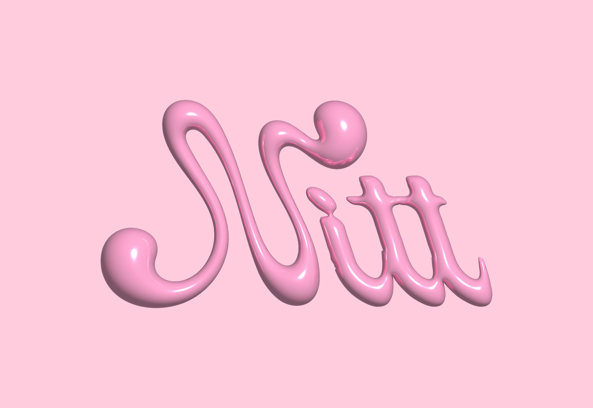
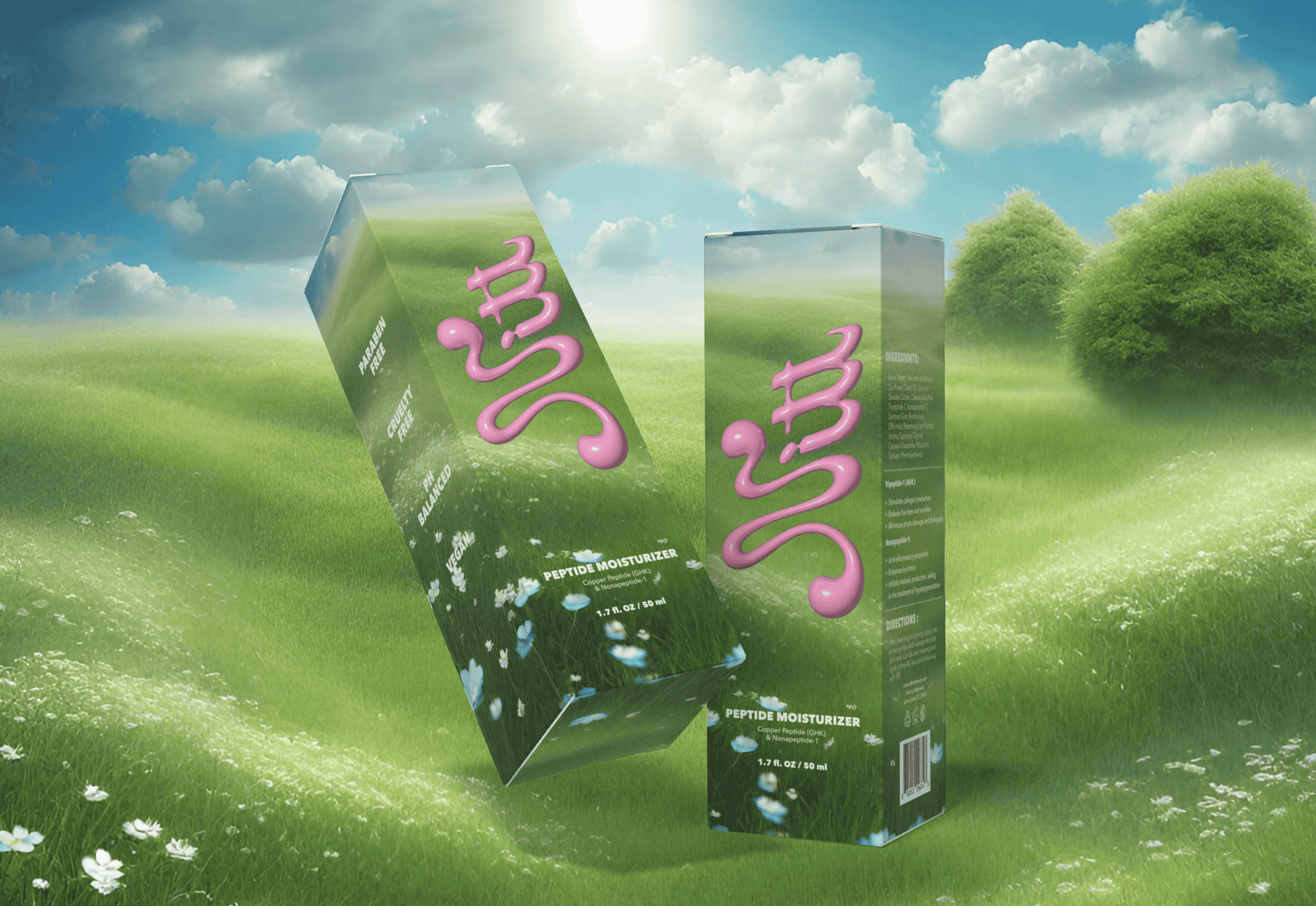
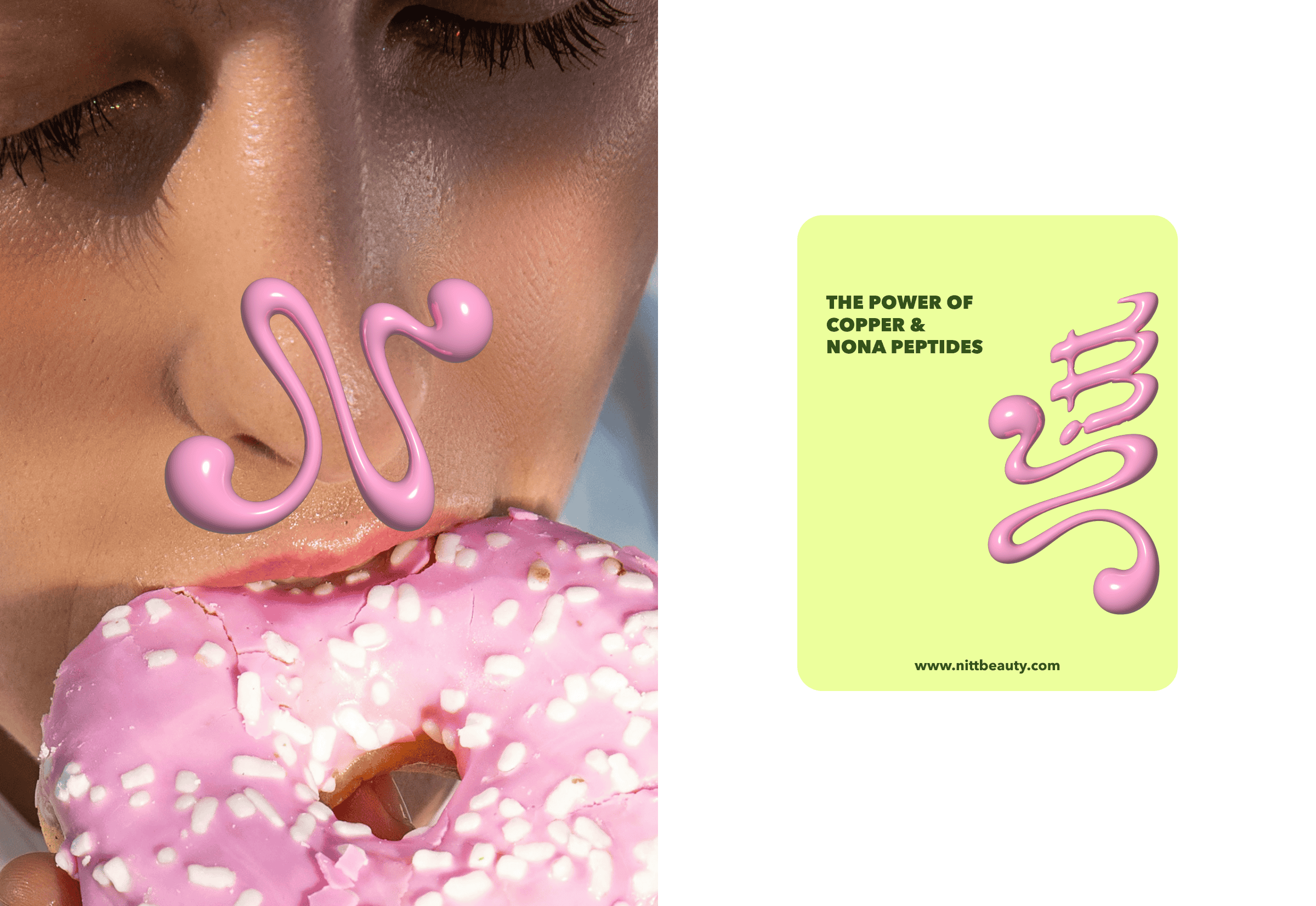
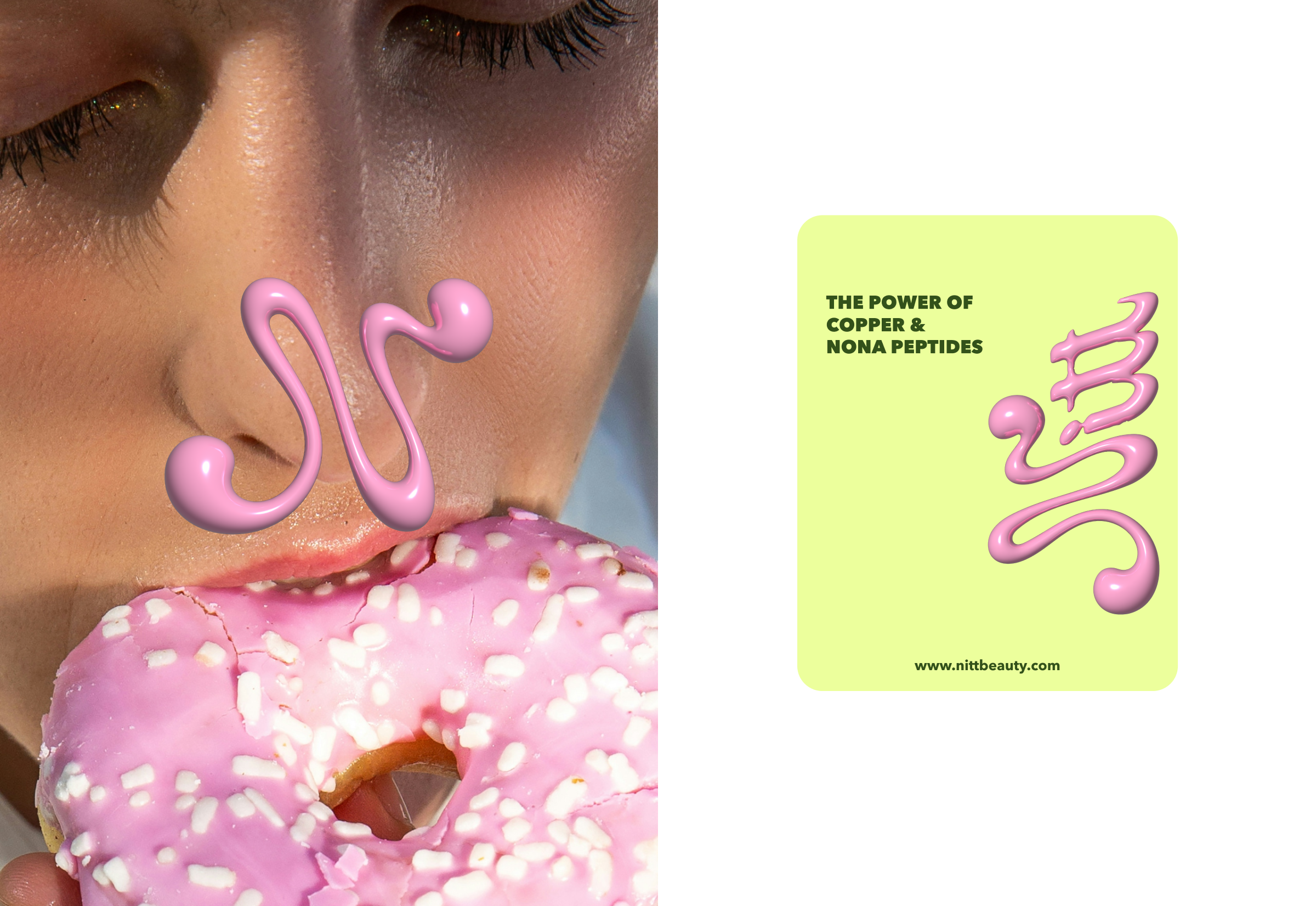
The concept combines minimalist packaging with expressive graphic elements inspired by early-2000s Y2K aesthetics. Metallic aluminum tubes create a sleek, clinical foundation, while the identity introduces a glossy liquid pink symbol — a soft, fluid mark that references the texture of skincare formulas and the visual language of liquid materials.
This contrast between restrained packaging and playful, almost futuristic graphics creates a distinctive visual tension.
Highlight
Featured in Vanity Fair magazine
Challenge
The challenge was to create a skincare identity that felt clean and credible while still standing out in a crowded beauty market dominated by minimalist brands.

Solution
We introduced a visual system that pairs restrained metallic packaging with a bold liquid-inspired graphic mark. This balance between minimal structure and playful Y2K-influenced elements allowed the brand to feel both modern and distinctive while maintaining a premium beauty aesthetic.
Absolutely loved working with my Kate! She really understood the vision I had for my brand and brought it to life perfectly. She was creative, professional, patient with all of my ideas and revisions, and made the entire process so easy. I’m so happy with how everything turned out. I would recommend her to anyone looking for a talented and reliable designer, especially if you’re building a brand and want someone who genuinely cares about bringing your vision to life. I’ll definitely be working with her again for future projects!
.png)
.png)
.png)
.png)
.png)