Kokoa
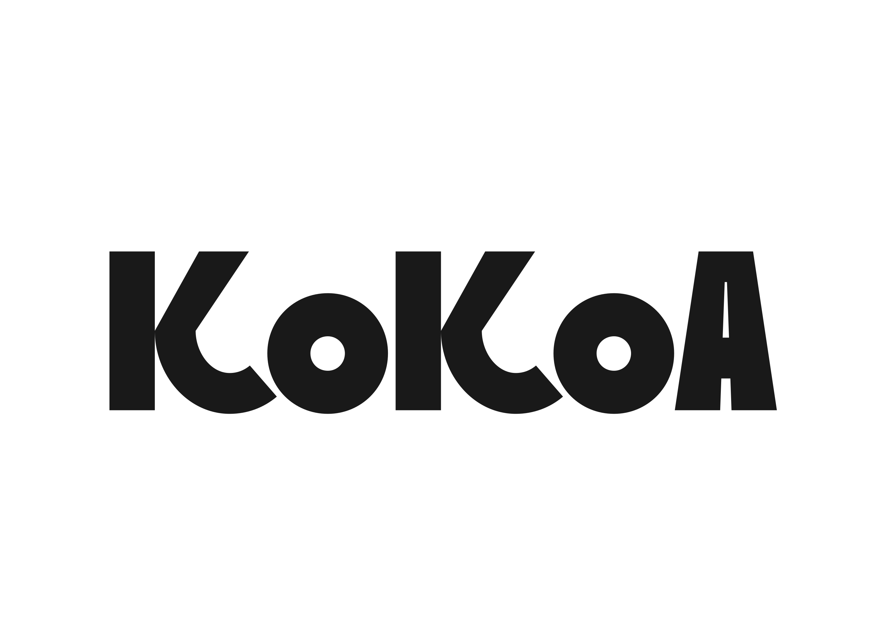
We developed the brand concept, visual identity, and packaging system, creating a bold and minimal chocolate brand that celebrates the raw essence of cacao.
.png)
Overview
KoKoA is a conceptual chocolate brand inspired by the raw purity of Peruvian cacao. The project explores how bold, minimal design can express intensity, clarity, and origin without relying on traditional luxury cues.
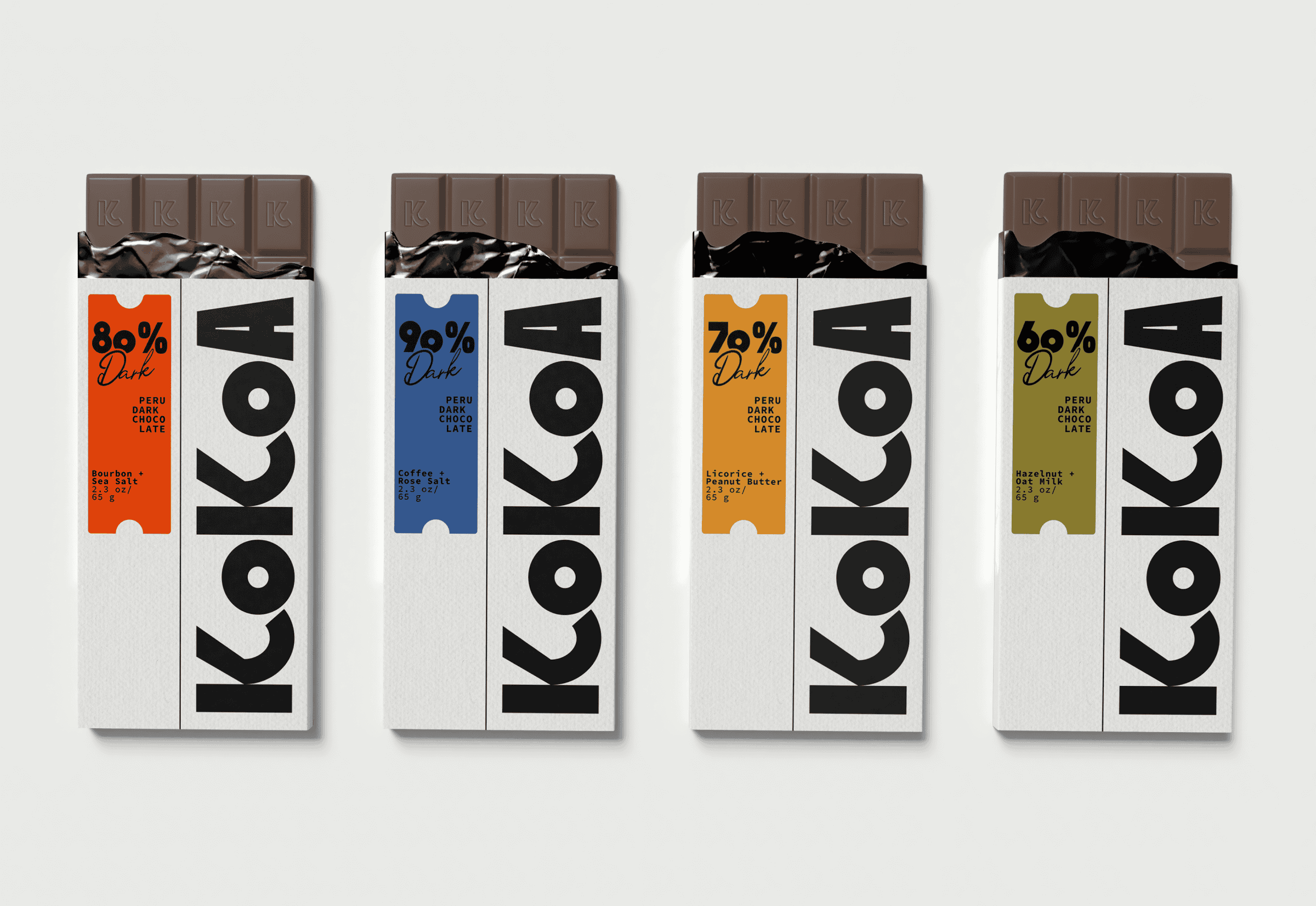
Each bar represents a different cacao percentage — from 60% to 90% — allowing the product itself to lead the experience. The brand rejects unnecessary decoration, focusing instead on strong typography, clear structure, and honest communication.
KoKoA is designed for those who appreciate depth and simplicity — a contemporary take on dark chocolate that feels direct, confident, and uncompromising.
Highlight
Featured on The Dieline
Featured on Behance
Challenge
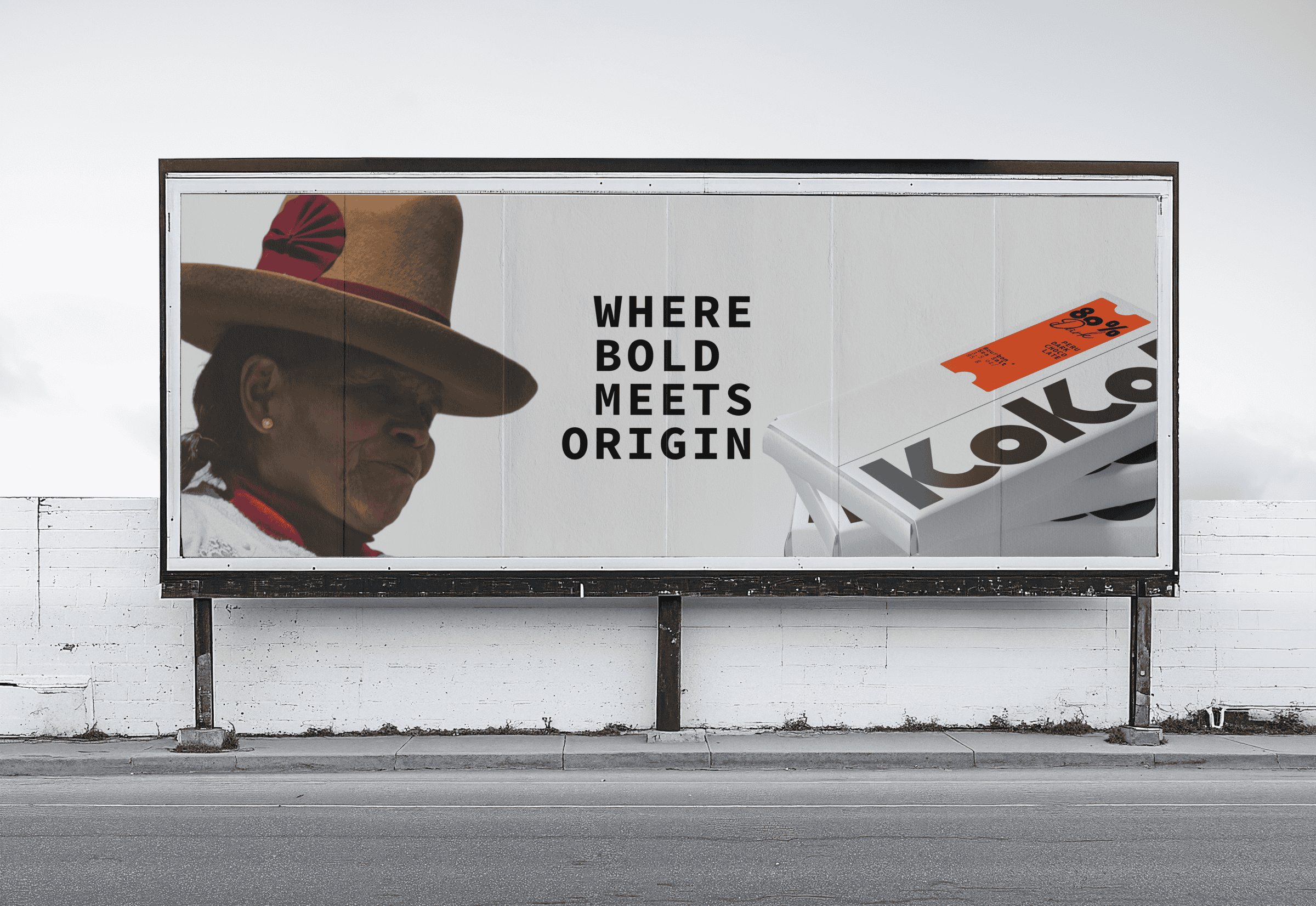
The challenge was to create a chocolate brand that stands out in a category often defined by ornate, heritage-driven packaging. The goal was to strip the experience down to its core while still delivering a premium, desirable product.
Solution
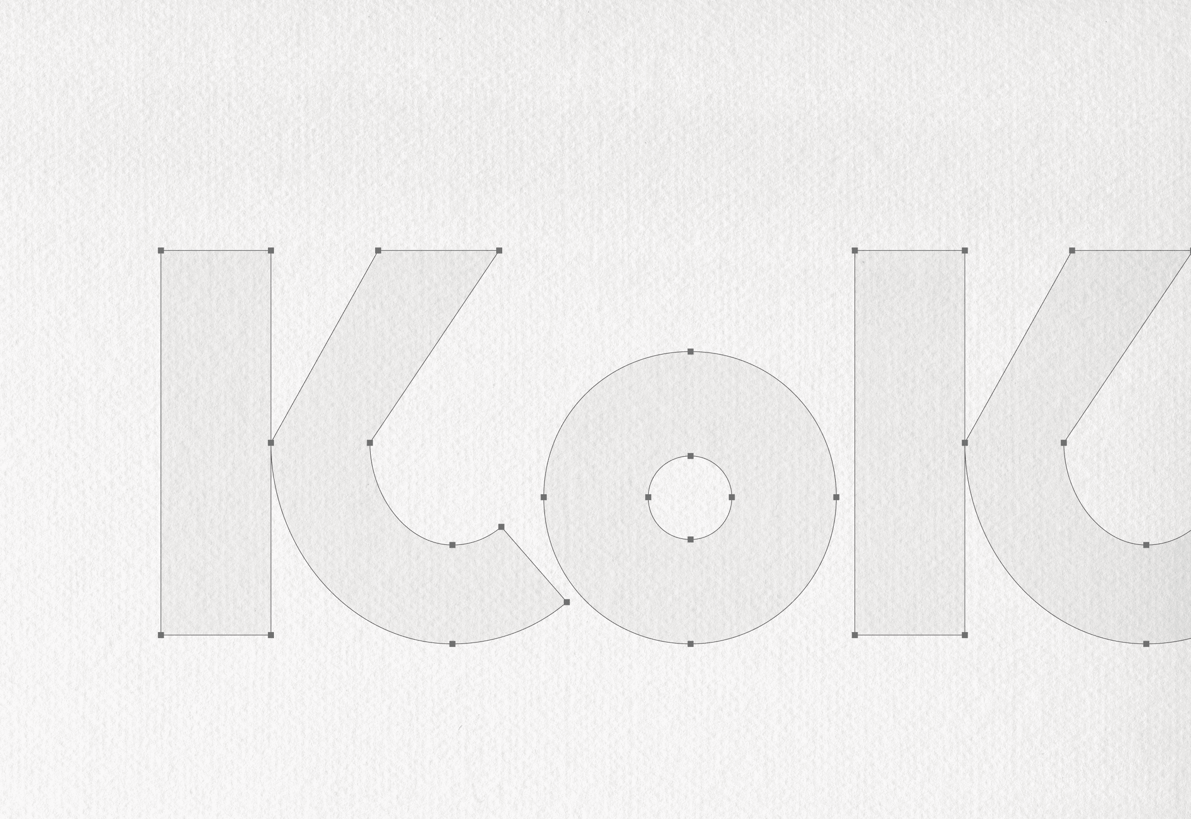
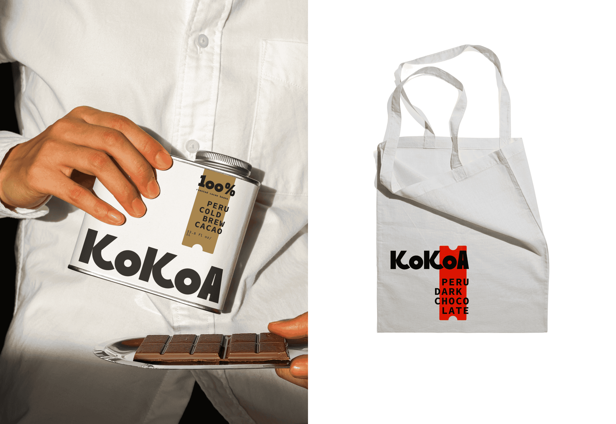
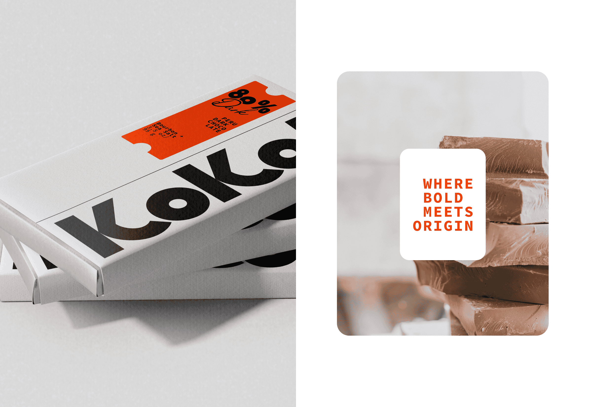
We developed a bold visual system centered around oversized typography and a strict, architectural layout. The black logotype cuts through white space with confidence, while color-coded accents communicate cacao strength and flavor.
The packaging balances matte minimalism with subtle texture, creating a tactile and collectible product experience that feels modern, honest, and distinctly recognizable.
.png)
.png)
.png)
.png)
.png)