Hot Girl Soda
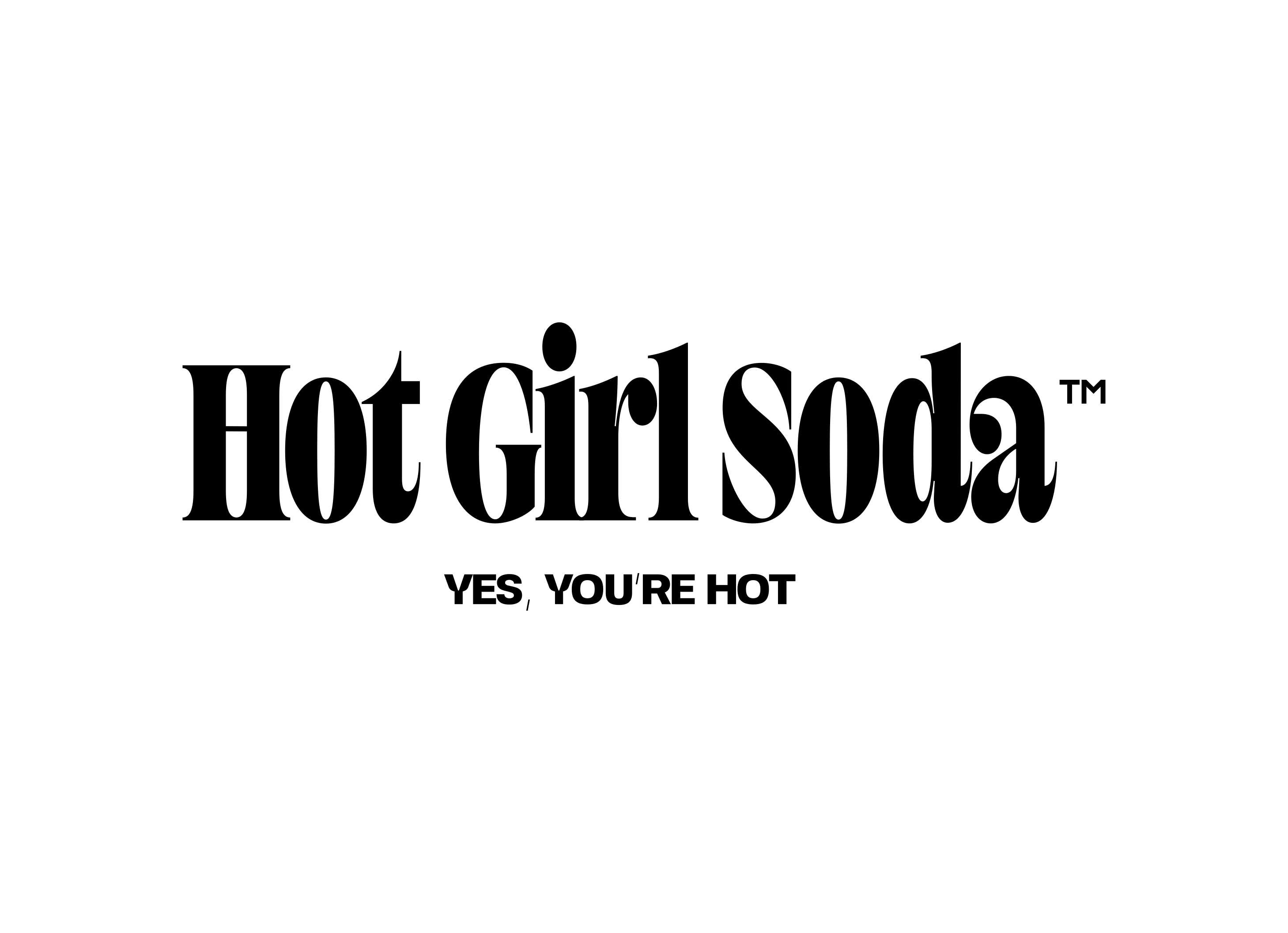
We worked closely with the founders to shape the brand’s positioning and develop a distinctive visual identity, defining the creative direction and packaging system for the initial product launch.
.png)
Overview
Hot Girl Soda is a California-based beverage brand focused on creating playful, modern soft drinks for a new generation of consumers.
We worked with the founders at an early stage to define the brand positioning and develop a distinctive visual identity that could stand out on shelves and across digital platforms. The project included brand strategy, visual identity development, and packaging direction for the initial product line.
Following the launch, the brand was featured in Pop-Up Grocer and later appeared on the well-known TV show “Shark Tank”, bringing national attention to the product.
Highlight
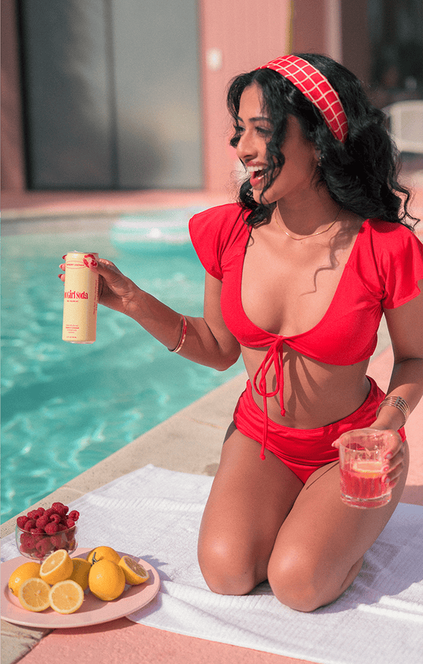
Launched at Pop-Up Grocer store in NYAppeared on Shark Tank (US national broadcast)
Challenge
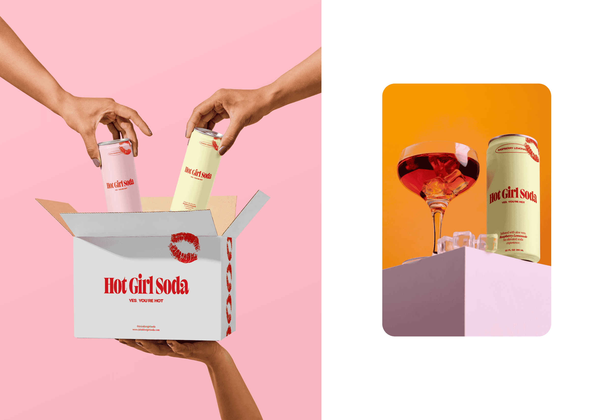
The brand needed to stand out in a crowded beverage market while maintaining a sense of clarity and modernity. The challenge was creating a visual identity that feels distinctive and playful without losing the clean, premium sensibility expected from contemporary consumer brands.
Solution
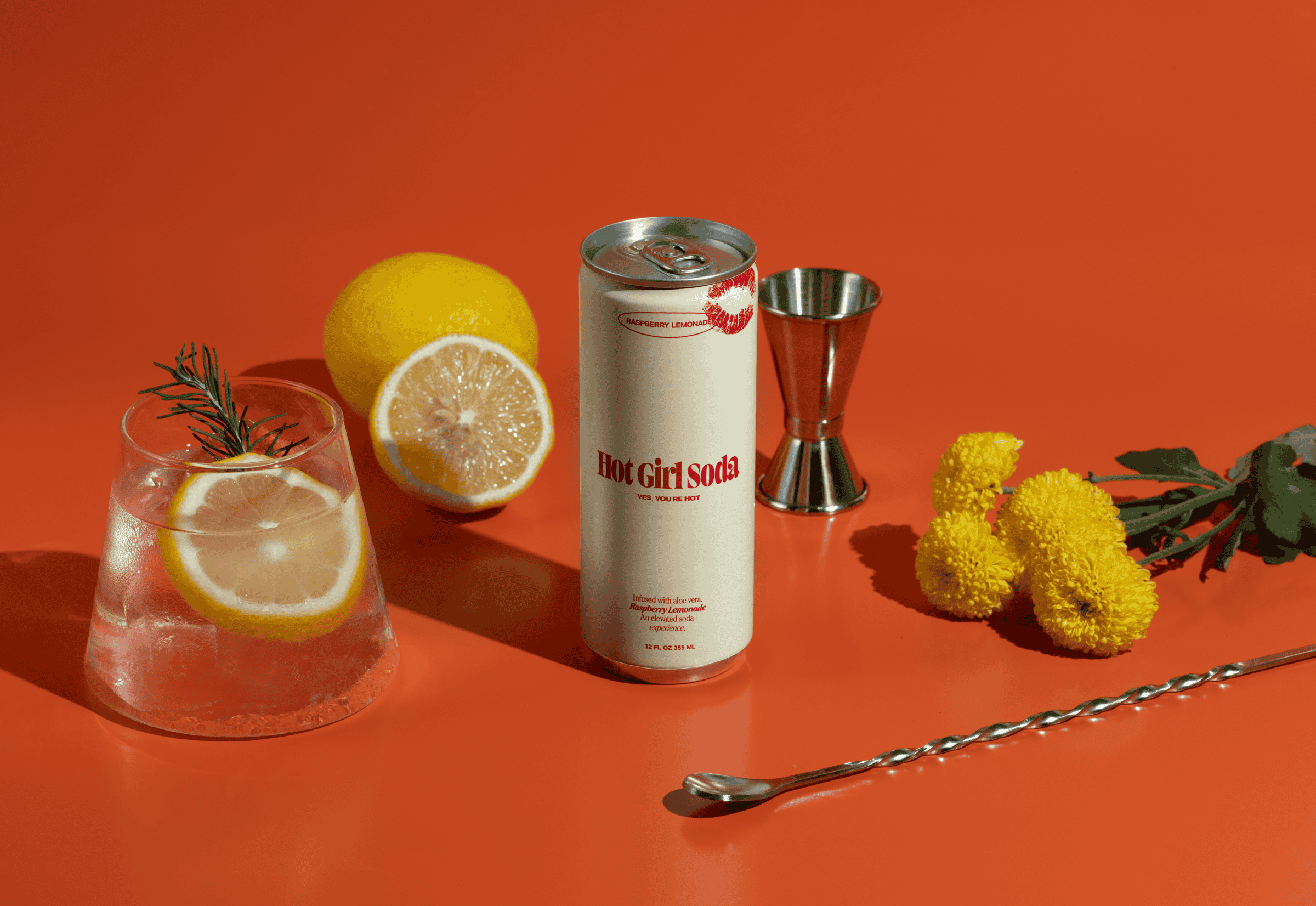
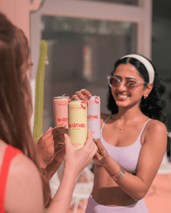
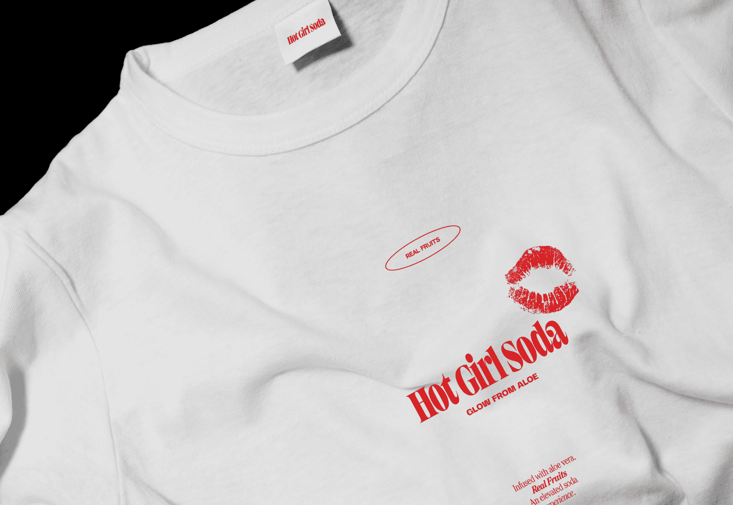
We created a vibrant visual identity inspired by the nostalgic spirit of California—sunny, playful, and effortlessly confident. Bold typography and a fresh color palette bring that feeling into a modern context, capturing the charm of the past without leaning into an overtly vintage aesthetic.
Working with Kate on the Hot Girl Soda logo, branding, and packaging design was honestly a great experience. From the start, she made the process feel very collaborative and never rushed any decisions. She took the time to really understand us as founders, what we wanted the brand to feel like, and who it was for.
She went through multiple iterations with us and was incredibly thoughtful and detail oriented throughout the entire process. Kate genuinely cared about getting everything exactly right and made sure the logo and overall branding felt authentic and aligned with our vision.
Her design work has played a huge role in our business. One of the number one compliments we consistently get is around our packaging and branding, and that is a direct result of her work. She was able to create something eye catching and memorable without it feeling overpowering or losing the brand’s voice, which is not easy to do.
The end result gave us a brand foundation we are truly proud of and confident building on. I would absolutely recommend Kate to any founder or brand looking for a collaborative designer that can help bring their brand/ vision to life.
.png)
.png)
.png)
.png)
.png)